
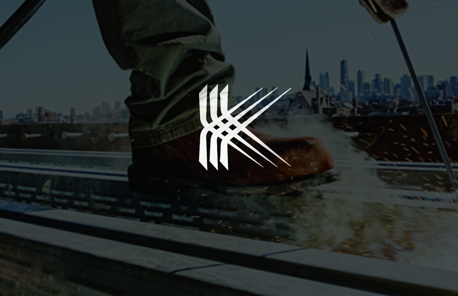
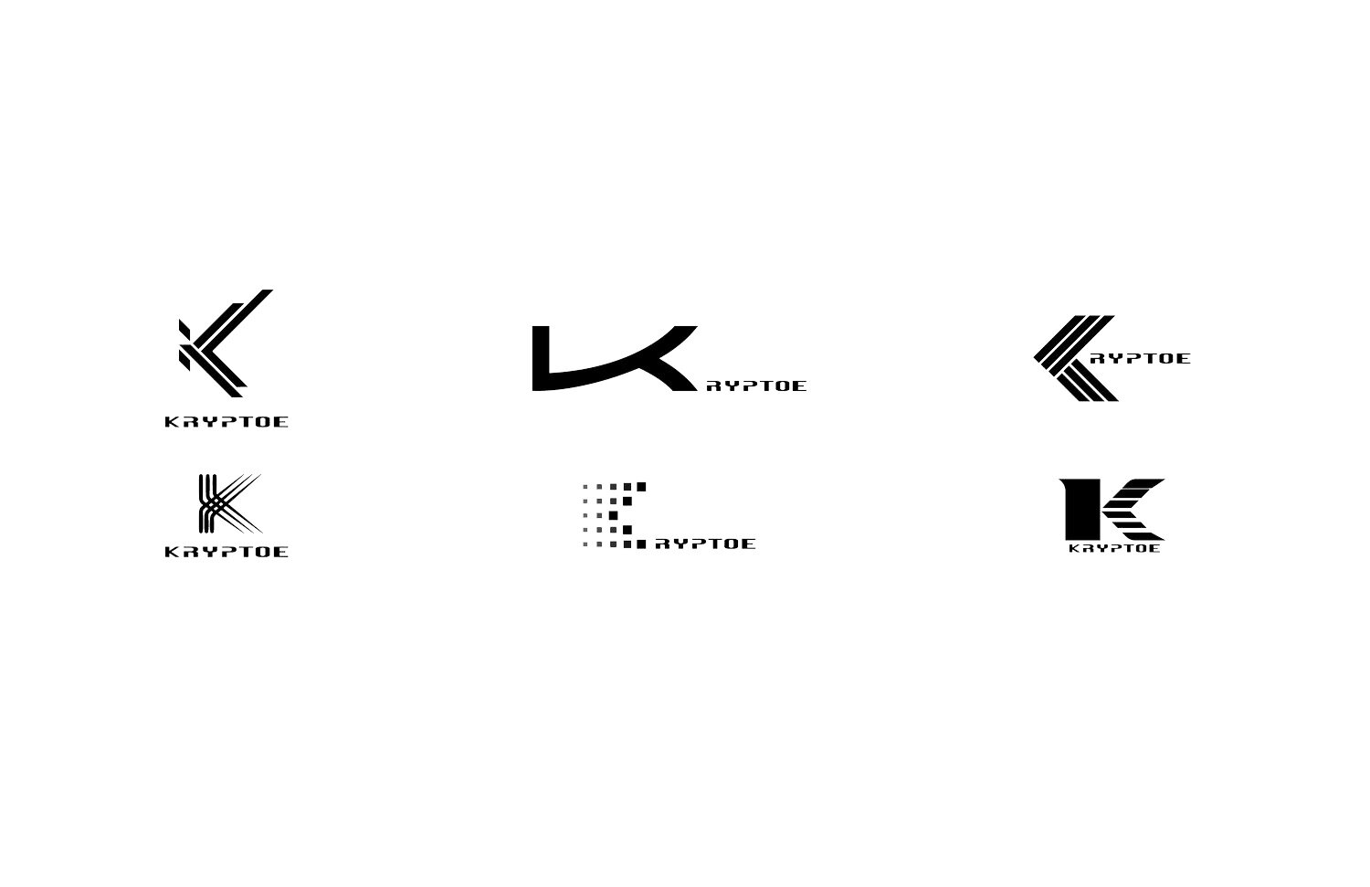
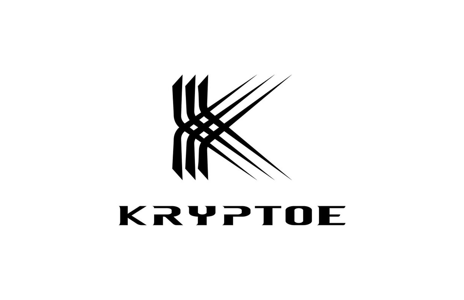
Terras nano safety toe
The strands of the K start bold to show the strength of the toe, while finishing thin to show the lightweight nature, crossing over to create a strong lightweight weave. The R and P both have a sideways U shape to signify the safety toe profile
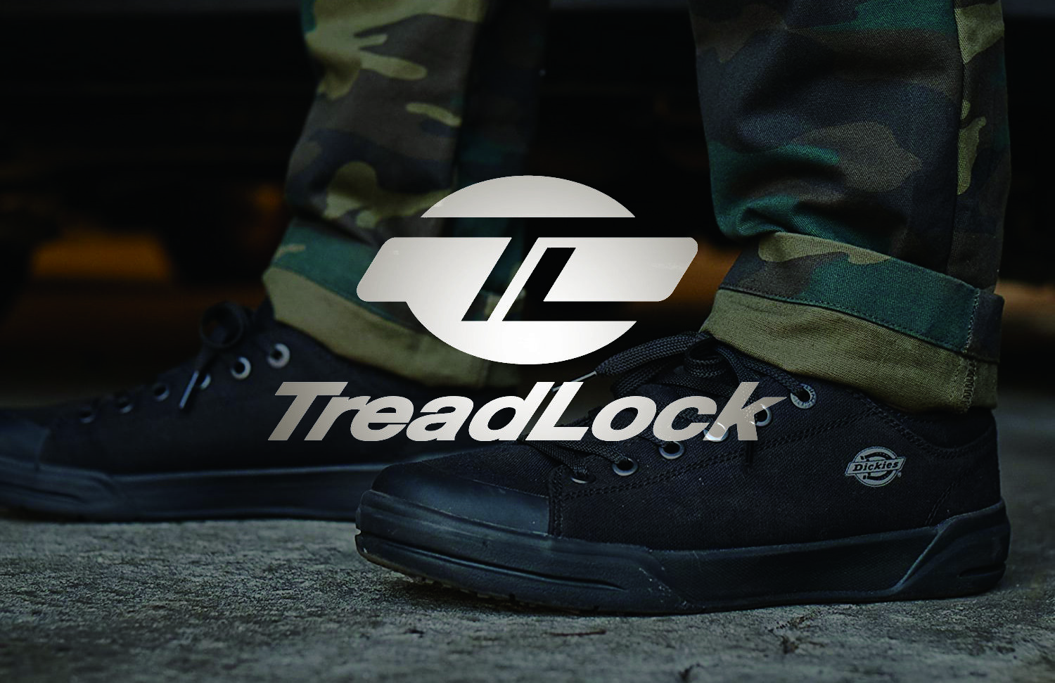
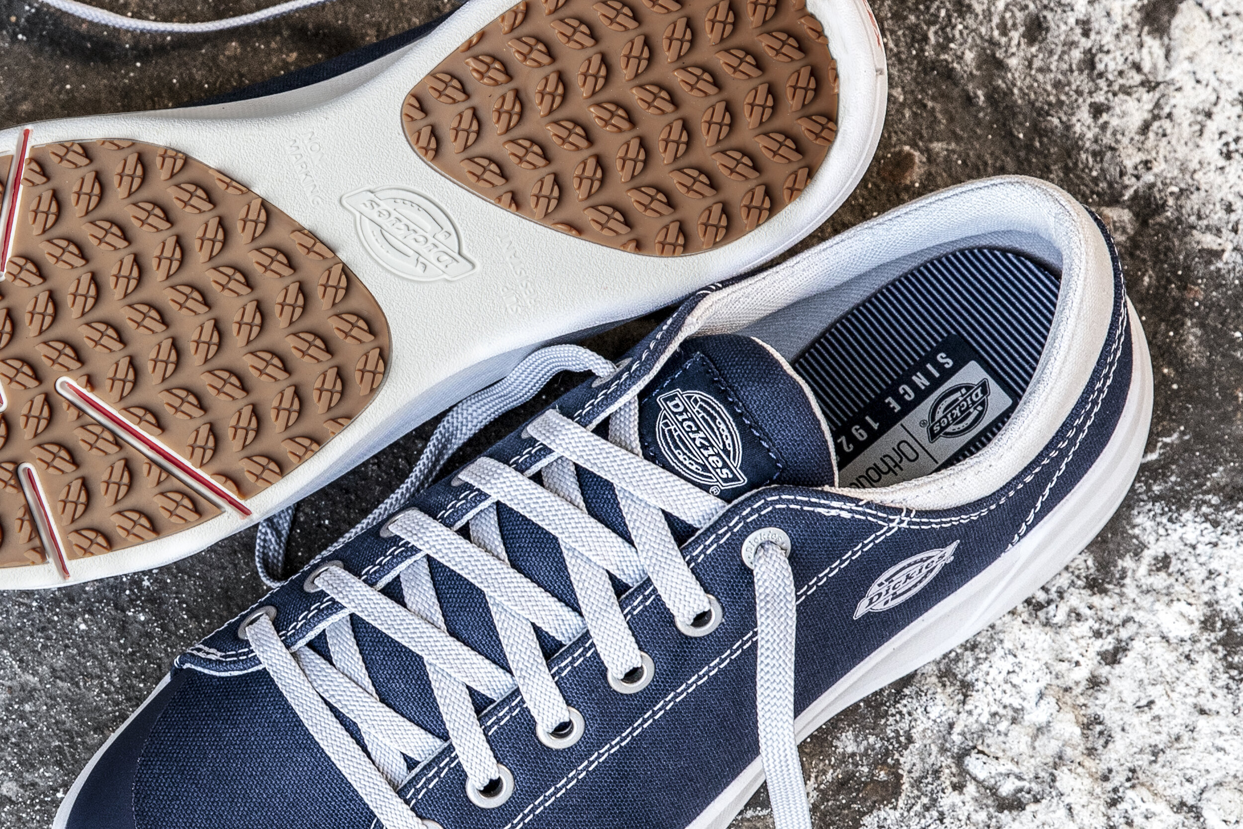
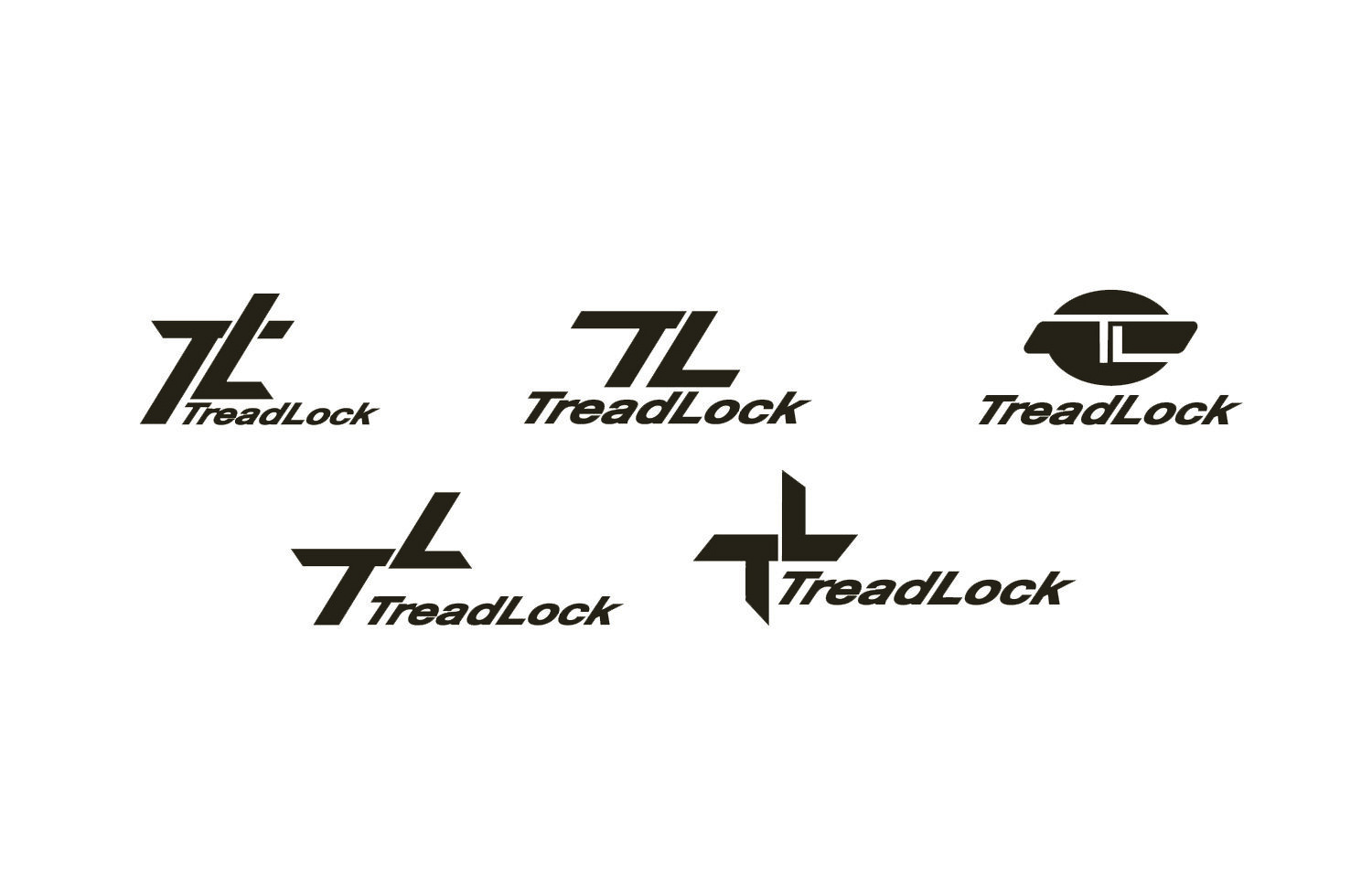
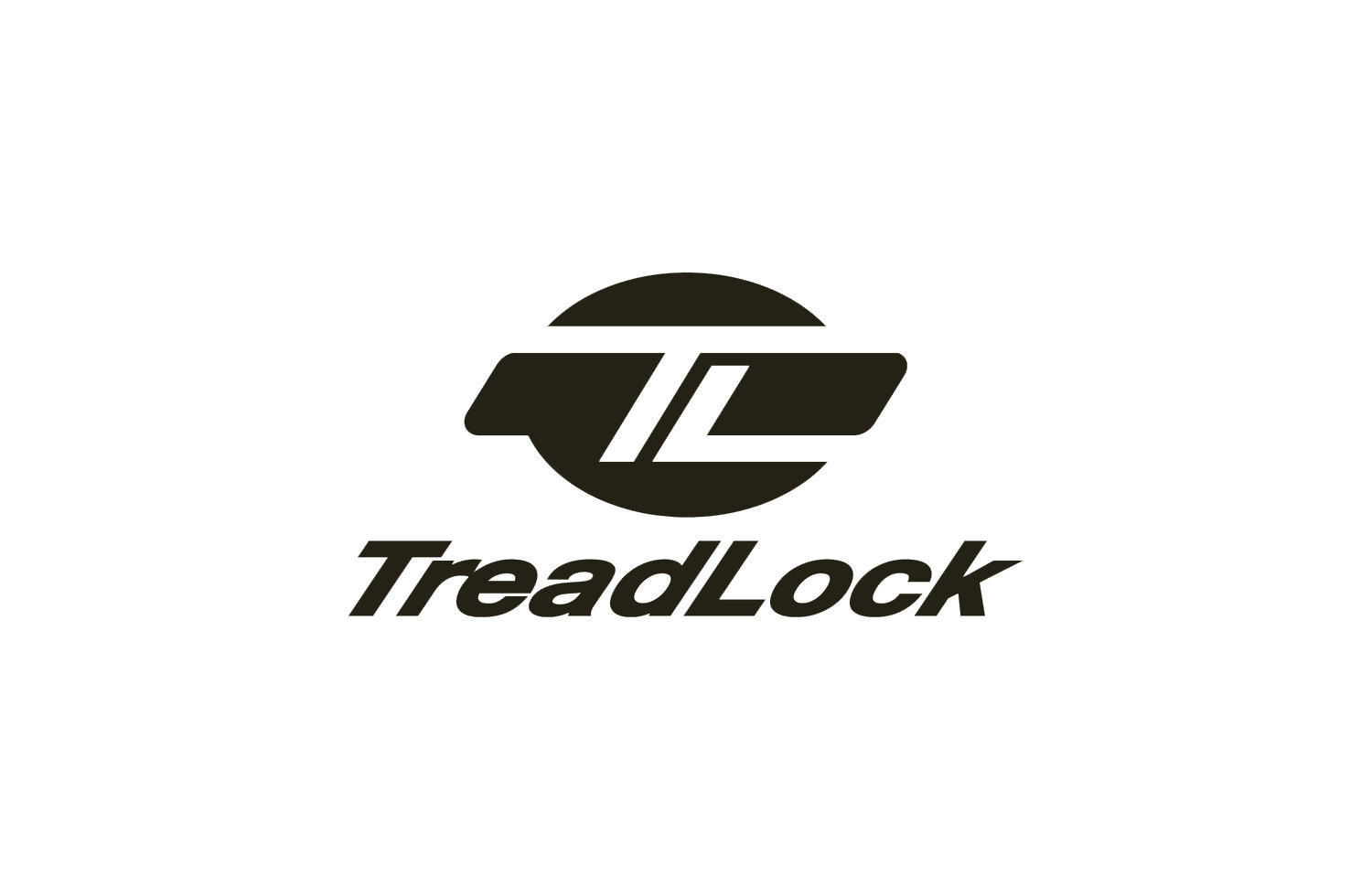
Dickies premium slip resistance
Form follows function, using the tread pattern itself as inspiration for the logo, based off of the original Dickies logo
Taking the silhouette from the lug pattern, and utilizing the sipe patterns, I was able to delineate an icon using the TL inside of the Dickies logo
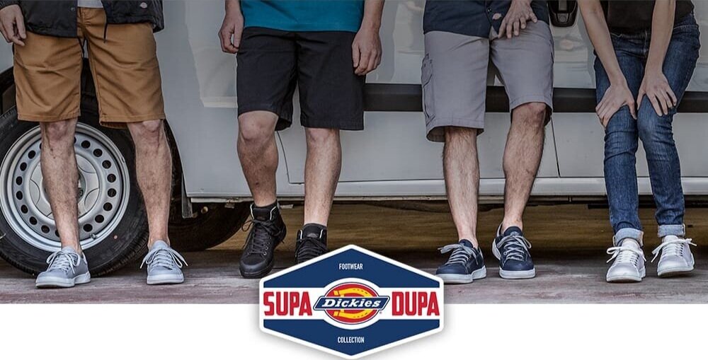
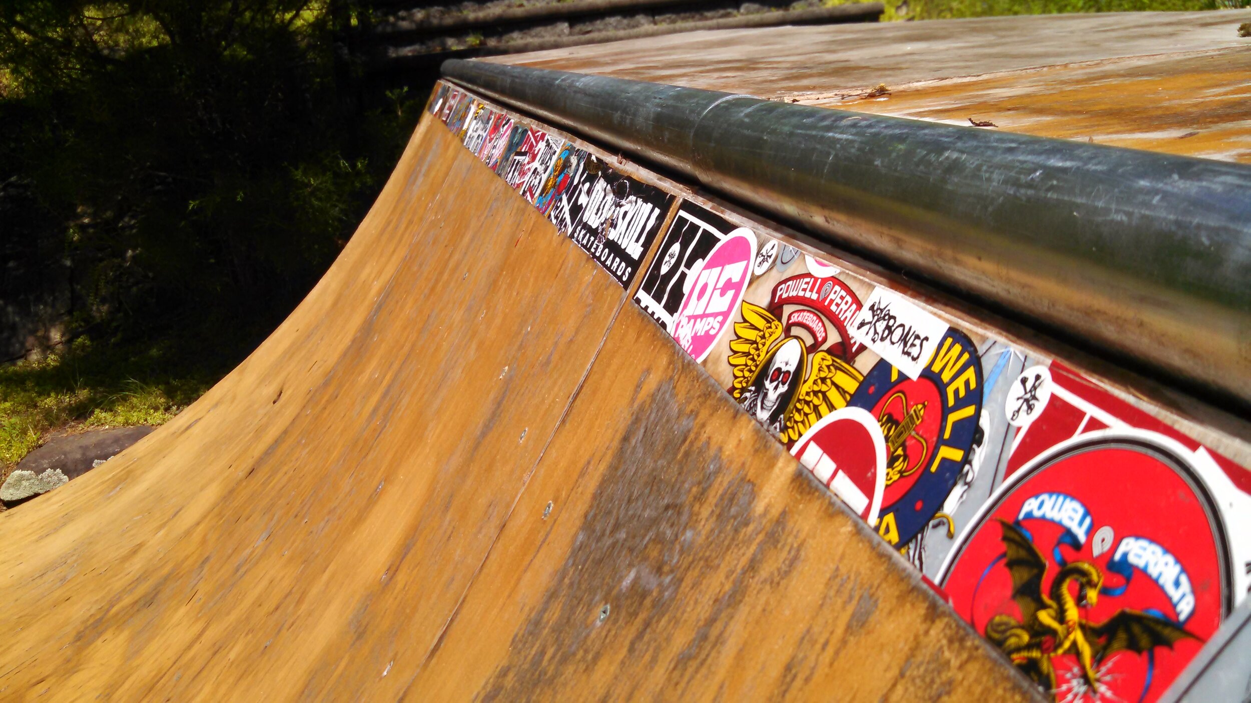
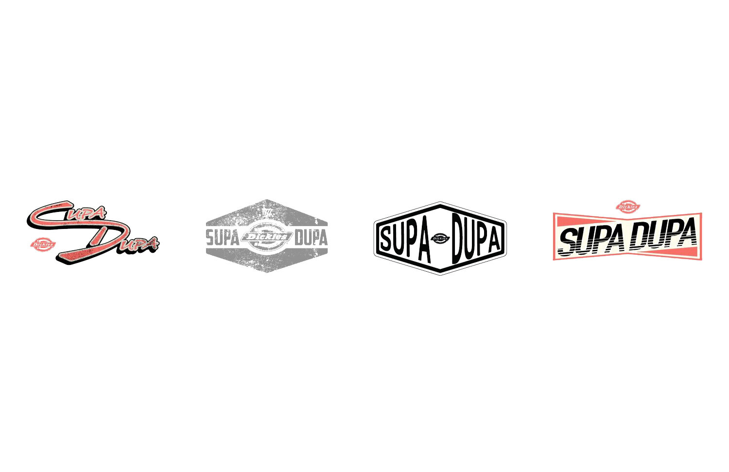
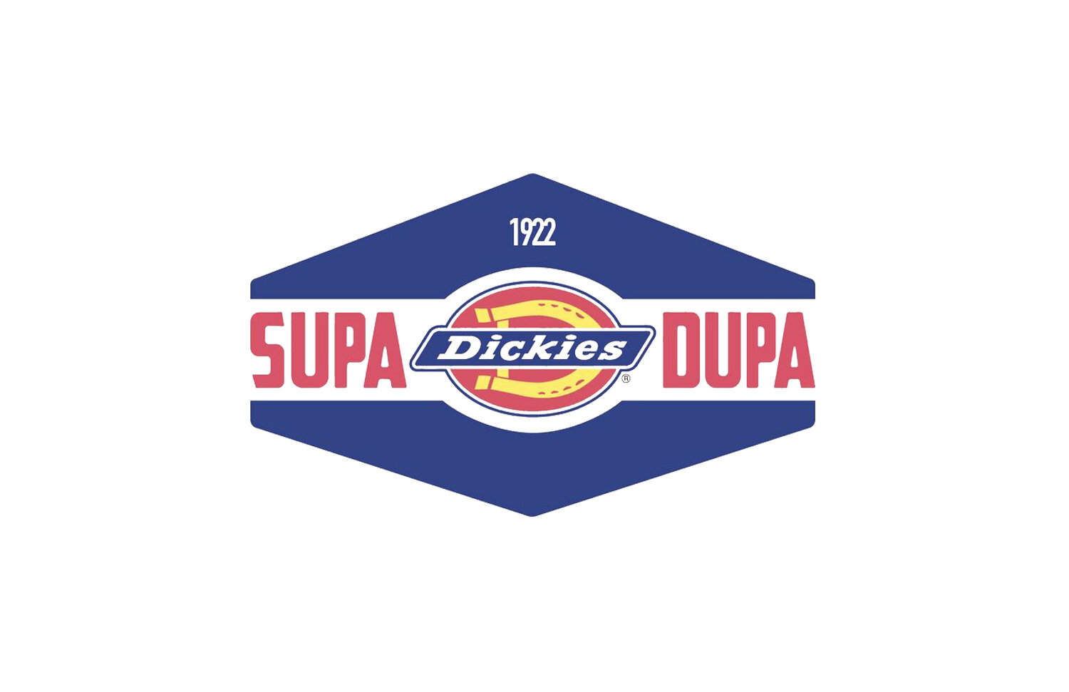
For Dickies Supa Dupa Footwear collection
We wanted to evoke a young, active feeling for the Supa Dupa, so we pulled inspiration from slap stickers often seen in skate parks or on signs as graffiti.
Bold Title lettering, housed in an iconic hexagonal shape framing the Dickies logo.
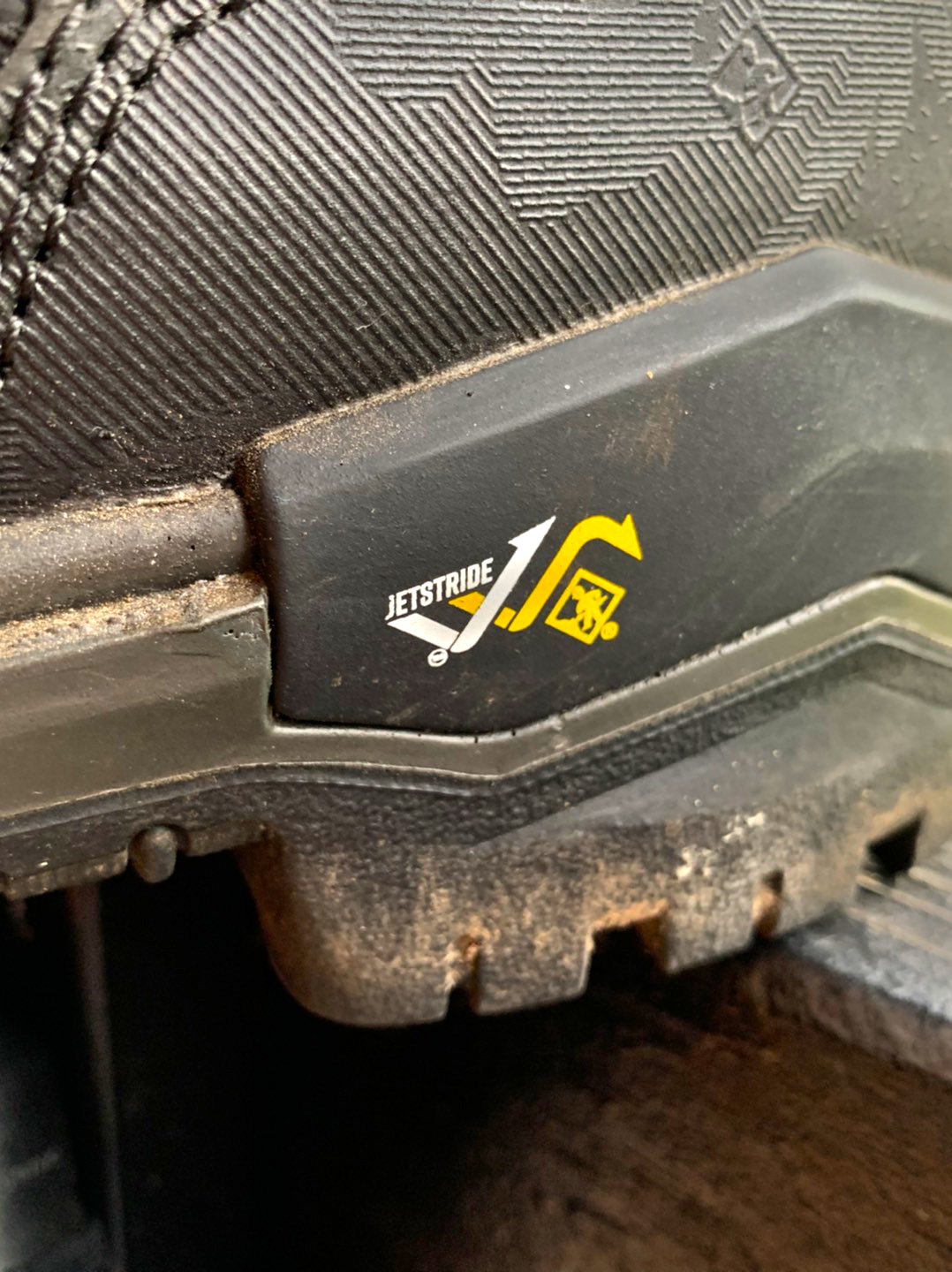
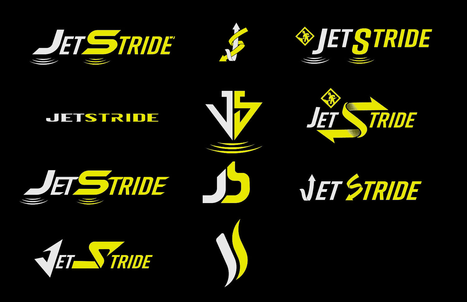
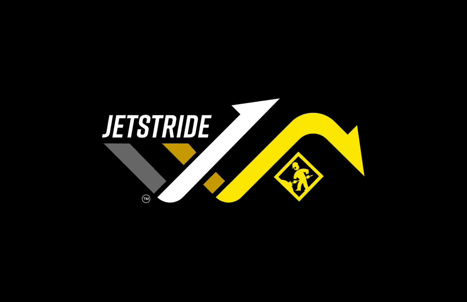
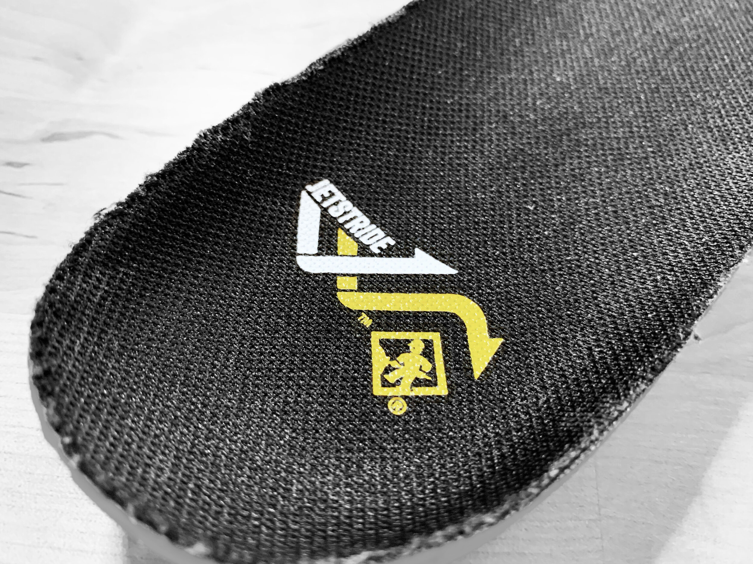
The overall idea was trying to incorporate the arrows, showing the active comfort of the footbed
The Arrows both show lots of movement, and the action of force being rebounded - shown by the bouncing nature of the arrows. The white arrow forms the J and the yellow arrow forms the S for JetStride.
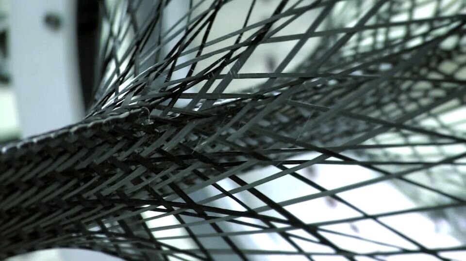
Terra’s premium comfort story with high rebound ETPU pods and a stable poured PU chassis